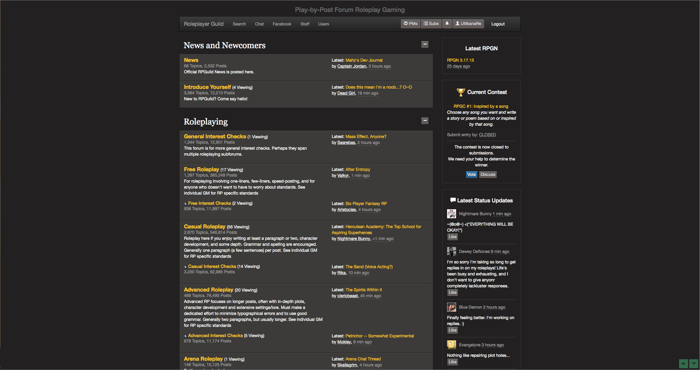

Looks the same to me (just obviously different resolutions).


Whats going on?
Any reason I can't Like/Laugh/etc a status from someone's User/Bio page?
http://gyazo.com/ea43dd5b68b911624610be82f0a5c61f
The fuck...
<Snipped quote by ravenDivinity>
I wouldn't particularly desire that. The text is small enough already, and that would just add confusion. I'm in favor of making the entire timestamp the link to the latest post.
Obviously the UI design here kinda sucks at that width, but until I think of something better, the idea is that people can associate the[-->]button as the "go to the latest post" button.
If timestamps were always hyperlinked, do you think that would be obvious to people? Maybe I can just replace the buttons with hyperlinked timestamps altogether?


<Snipped quote by LegendBegins>
Sucks, but I can understand the reasoning behind it. i guess things like quotes will have to go in the bio and status updates rather than the sig space.
<Snipped quote by Dinh AaronMk>
Given that it is a school computer, it is perhaps more likely that your school's firewall is not liking the Guild, probably for reasons tied to the Guild's content.
Mahz, did you or someone upload a virus to the site because the Mac* here at school is flipping the Hell out whenever I visit this site.
To make everyone comfortable: there's nothing going on I needed to pay attention to at this time.
*Yes I know this seems almost contradictory because "lolMacsDon'tgetViruses", which is surprising me.
@Captain Jordan Maybe only track unread posts for topics you've viewed then? (imo) It shouldn't apply to every topic on the guild, it is just really distracting imo to have [NEW] covering every topic on the forum.