Feigling said
I thought it was pretty simple. Light parts were land, dark parts were water. But then again, that's just me.Would you like me to choose a different map? I have a couple in reserve.
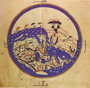
Lights-on-darks and darks-on-lights will not fix anything if there's otherwise illustrative differences between landmass and water. The drawing of mountains for instance, or actual coloration of something against the base color of the map or blue.

As an example: land and sea is differentiated not only but color but dictation of the geography. Not to mention the drawing of ships where the sea is.
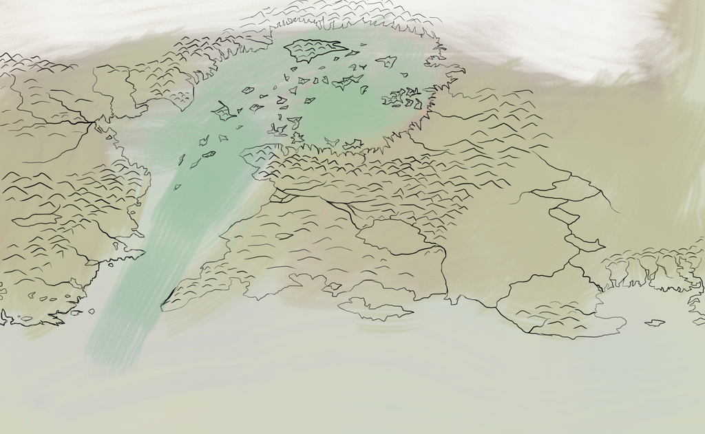
The same rule is apparent here:

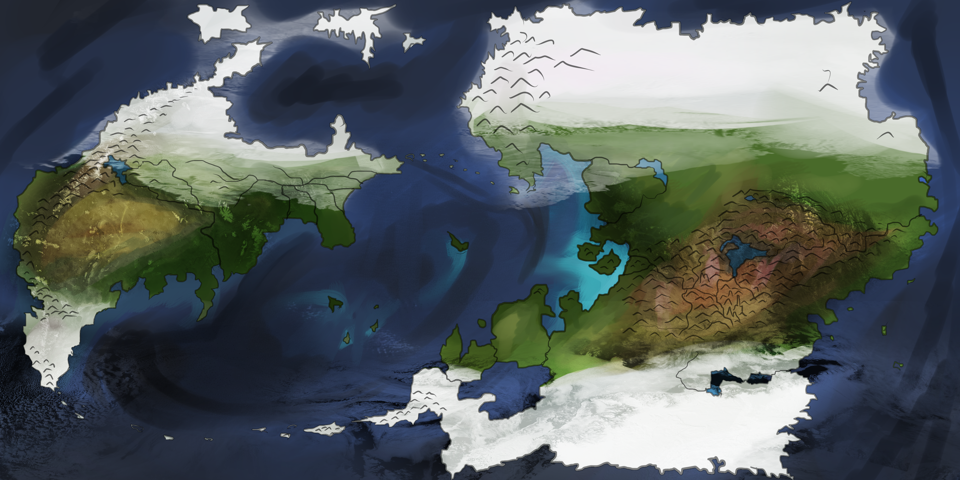
Likewise:

You can just tell what's what. Shading doesn't often really mean anything without something else dictating. In a broader sense illustration helps expand on things by showing the terrain. Is it hilly or is it mountainous? Where are the rivers? Lakes?
These are maps I've done for other role-plays before.
Layer modes aside on the last, I at least try to make an effort to depict geography, which is the least one can do to encourage consistency in something all throughout. Otherwise geography ends up being as random and unnatural as Minecraft world generation.
Layermodes, which went into the last one, help to dictate a better detail of the region without having to go into regional descriptions, which I've done for the middle one.


