Brand said
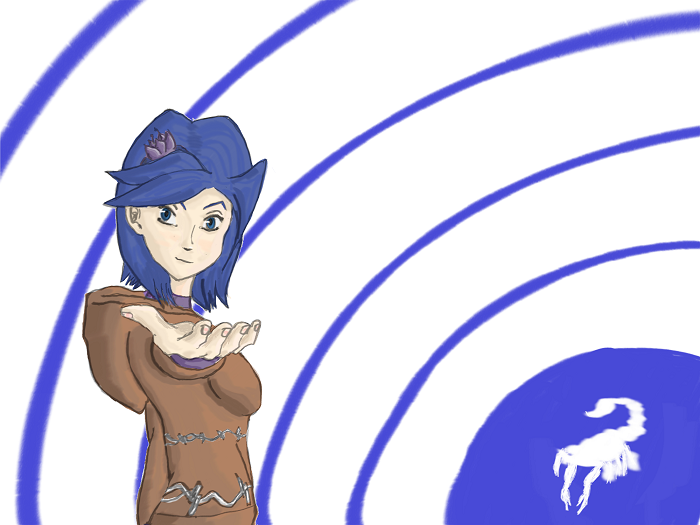
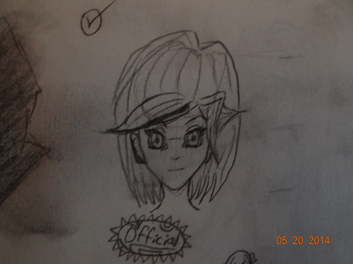
Your foreshortening is good. The biggest problems I see is the structure of the face. For an anime style, the right side looks good. But I feel like the left eye is angled oddly, and needs to be drawn facing the viewer more, and we should see less of the ear too, but just a tad less. I think its mostly the left eye. The second problem, and the biggest in my opnion, is the background. I feel like the background is competing with your subject. I think even just filling in the white with some other (lighter/ less saturated) color would do good, and It also never hurts to make your background fade gradually following the lightning of your subject. So darker in the lower left corner, and lighter in the upper right with the light source. I also feel like more contrast on the subject wouldn't hurt, but honestly since your drawing more of an anime style anyway I'm not sure how necessary that would be. Like I said earlier, your foreshortening is pretty damn good.
Thanks for the input! =D
I tried to angle the left eye with the face, as it's sort of looking down, and turned, but after reading your thoughts, I can now see that it's a little screwed up. I'll try to fix that.
I sort of like how the ear looks though. Perhaps if I pushed it back a bit further it would look more like I want it to, and not look like I'm showing too much of it? I'll give that a shot too.
Backgrounds... yeah. I'm terrible at doing backgrounds. It's my weakest area as an artist. =\
I can definitely see how more contrast would help the picture, since a great deal of the picture is blue, but that's sort of the theme for the character. =]
EDIT: Or do you mean more contrast in the color scheme as a whole?
