Long door is long.
Dinh AaronMk my beloved (french coded)
Member
Seen
4 days ago
The ribcage, i meant to wrtite that the ribcage looks wide to me. >.<
OP
stark snarky genius
Member
Seen
4 yrs ago
@Dinh: I'll only comment on the newer stuff, since it's more relevant:
1.) Never paint with the colors black or white. Ever. (Especially for skin tones.) They invariably suck the life out of all other colors around them. A tutor of mine once told me something that kind of blew my mind once it clicked -- the colors black and white don't actually exist in real life because they're always either absorbing or reflecting the colors that are around them, which always adds a tint to them. Painting with black and white to mix your shadows and highlights always has a very plastic/artificial look because the eye knows it's wrong. (The brain may not have the knowledge to explain why it's wrong, but your eye will still know something looks off. Kind of like when anatomy is off -- you may not be able to explain or even correct it because you don't have the knowledge to do so, but even the most inexperienced amateur will be able to look at something and know that it's not sitting quite right.)
Look at shadows around you when you're outside next time -- you'll notice they're not black, usually just darker shades of blue (depending on the time of day). The more you look around and study the lighting around you, you'll find it to be more and more true that black and white are never actually black or white like you think they are. Knowing things like this will help your color work immensely and instantly bring a level of realism into your work that you didn't have before. An excellent book for learning how colors and lighting temperatures (warm and cool lighting) work is Color And Light by James Gurney. This thing is practically my bible. It's written for traditional artist, but everything he says applies to digital art, too. It's a fairly inexpensive book and it's super helpful. Also, painting objects from life will help you to get the hang of colors/lighting better. Doing still life work will teach you almost everything at the same time (you learn lighting, color, texture, perspective, proportion, how to control your brushwork, etc.), so they're really the best way to learn to paint.
2.) Anatomy -- yours is having some issues. For instance, the ribcage is too short, but the torso (abdomen, from under the breasts down) is too long (based off the measurements of the woman's head). Anatomy is the bane of every artist and it'll drive you crazy... I don't think anyone every truly masters it, they just gain enough knowledge to get by. Even the most seasoned artists continually do anatomy studies because the human body is something that is so complicated, even the slightest movement will entirely change how a muscle is rendered or the perspective of something. The only thing you can do is study to fix it -- try to copy photos and measure out the proportions from the figures as closely as you can. Check out the Andrew Loomis books (especially this one) I linked under the reference section in the first post and you'll find some excellent books to help you do anatomy studies. Loomis is great for getting the basics down in an easy to understand lessons. (The wording is uncomplicated and he takes things step by step, not assuming anything on the student's end.) George Bridgman is my favorite for learning anatomy because he makes it look so effortless, but his books can be a bit difficult to understand. (They're really technical, which is excellent when you feel more comfortable drawing the figure/knowing the basics. He can be a bit overwhelming if you're still trying to get a handle on things, however, so I usually recommend him for intermediate level (+) figure artists.) Definitely check his work out, though -- his line work is really admirable, as is the way he handles his figures.
That all said, I can definitely see potential in your work. I'll be very interested to see more from you in the future!
@ Allen: Perspective, like anatomy, is a very tricky subject. There's an excellent video by an artist called Carl Dobsky on the subject, where he really takes and breaks down how perspective works and ways to correctly calculate all your angles/distances with minimal fuss. It can be tricky to find (because I don't know if it's even available through legal means anymore), but it was called 'Linear Perspective with Carl Dobsky'. The tutorial had two parts -- one for one point perspective, the second was for two point (or more) perspective. You can see the trailer for part one here and part two here. I bought this back a few years ago when it was first released, but I can't seem to find it to purchase from the original source anymore. (It's just not available on their site.) I'm not usually an advocate for 'alternative' methods of acquiring media (*ahem*), but it may be your only option in this case. Otherwise, I'd suggest just doing a search of youtube videos and seeing what you pull up. (I know there are a ton of them on there.)
And, in regards to your question about work looking flat, you haven't really added in any lighting to your drawings (at least that the ones you've posted here) so far, so of course they're going to feel a bit flat. Adding in lighting/shadows turns your flat lines into rendered shapes. If I draw a circle on a paper in just lines, then it's just a circle. If I add shading to that circle correctly, it will then become a sphere. (Even though they're both drawn from the same exact circle, adding in the lighting/shadows ultimate gives it form and depth.) Try adding some shading into your next drawing and see how it looks. ^_^
@Sheep: That's actually a pretty cool drawing. I actually like the stylized look and the muted colors. Nothing really I can think of to critique, but I'd definitely be interested in seeing some more work from you!
@LowKey: What is that a fan art of? (So that I can look it up and make suggestions where appropriate.) Meanwhile, try to use more confident lines when drawing -- you have a lot of scratchy lines clumped together to form your edges, which makes it look like you're very unsure of where to make your marks. If you use a single line, then your work will look far more confident. The plus side of working digitally is that you can 'undo' your lines if they comes out wrong, no matter how many times they do. Take advantage of that and try to use single strokes to define your edges, rather than several scratchy ones.
Alright, I was doodling last week, and this was what I ended up with. :p (It's rather PMMM inspired, by the way.)
I know the arm / elbow in particular looks a little weird, as well as the placement of the hand, but I don't really know how to fix it. Could I have some help with that, if possible? Also, do you guys have any advice on how to move from a more anime-ish style to a more semi-realistic style? I'm tempted to switch, but don't really know how.
I know the arm / elbow in particular looks a little weird, as well as the placement of the hand, but I don't really know how to fix it. Could I have some help with that, if possible? Also, do you guys have any advice on how to move from a more anime-ish style to a more semi-realistic style? I'm tempted to switch, but don't really know how.
Ink-berry said
Alright, I was doodling last week, and this was what I ended up with. :p (It's rather PMMM inspired, by the way.)I know the arm / elbow in particular looks a little weird, as well as the placement of the hand, but I don't really know how to fix it. Could I have some help with that, if possible? Also, do you guys have any advice on how to move from a more anime-ish style to a more semi-realistic style? I'm tempted to switch, but don't really know how.
The right arm's (our right, her left) proportions don't match those of the left arm. For hand-on-hip poses in particular I find that changing the angle formed by the upper and forearm will fix any awkwardness nine times out of ten. In your case, the elbow should be jutting out further and forming a more acute (narrower) angle, like so:
My redline arm is a bit too fat with respect to the originally drawn arms, the angling is more important to acknowledge though. You'll also notice an alternative hand pose, with the thumb rather than the four fingers facing the viewer. Admittedly, it's a cheap shortcut for making hands on hips look good with less effort. Otherwise I would suggest using photo reference, since hands at that angle can be pretty complicated.
Also if this group is still accepting members, I'd love to be added to the list.
OP
stark snarky genius
Member
Seen
4 yrs ago
@Ink: The best way to start switching style is to start using photo reference and/or start drawing from life. Try to draw things as realistically as you can based off what you see. (The more realistic you go, the more you'll eventually be able to simplify/stylize from your imagination down the road.)
It's always best to start out in realism because it's the base for every kind of drawing you can think of. (Everything from simplistic cartoons to high-quality renders.) The problem with starting off stylized (such as with anime) is that the anatomy has already been simplified by the artist, which means that, unless you already understand the structure of what you're drawing, it's setting you up to make errors. (Because you can't make stylistic choices like the artist is doing because you don't understand what it is you're simplifying.)
Think of it like riding a bike -- everyone starts off with training wheels to help them. Think of those training wheels like working in realism. Start off with a solid base to balance and learn from, then when you're more comfortable, you can take those training wheels off and zip around, no problem! If you try to start without training wheels, it's not that it's impossible to learn how to ride a bike that way, but it's going to take you much longer because it's going to be significantly more difficult. Don't simplify things before you're ready and your drawings, regardless of the style you want to draw in, will always have a push of believability that others will lack and you'll never be locked in to any one thing/style.
Eudoxa did a pretty good redline for you, so there's no need for me to be redundant.
The drawing looks like it could turn out cute -- definitely keep posting progress shots as you go!
@ Eudoxa: This group is always open to new members. I'll add you to the roster -- welcome aboard!
@Eudoxa
Alright, thank you for the tip! C: I'm in the middle of fixing it, and it's starting to look a little better.
@Sherlock
Now that I think about it, I think I do need to improve my basics / anatomy. I've never tried drawing realistic / semi-realistic humans before, so I guess that would be first step.
Thank you for that, I'll go and try it out now. :3 (And alright, I'll be posting more progress shots later on, as well.)
monstahunta
Member
Seen
10 yrs ago
Hello everyone.
About a week ago I did my first painting in a while, and would love critiques on it.
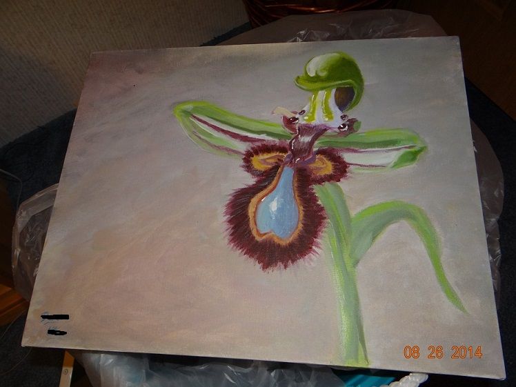
Thanks in advance.
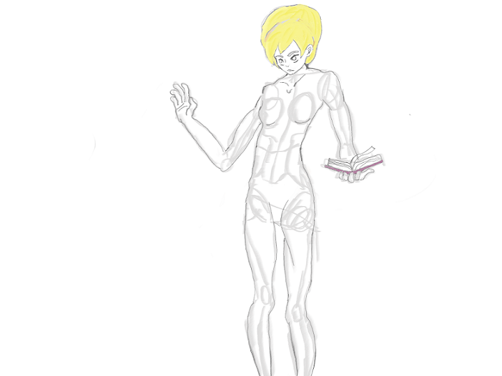
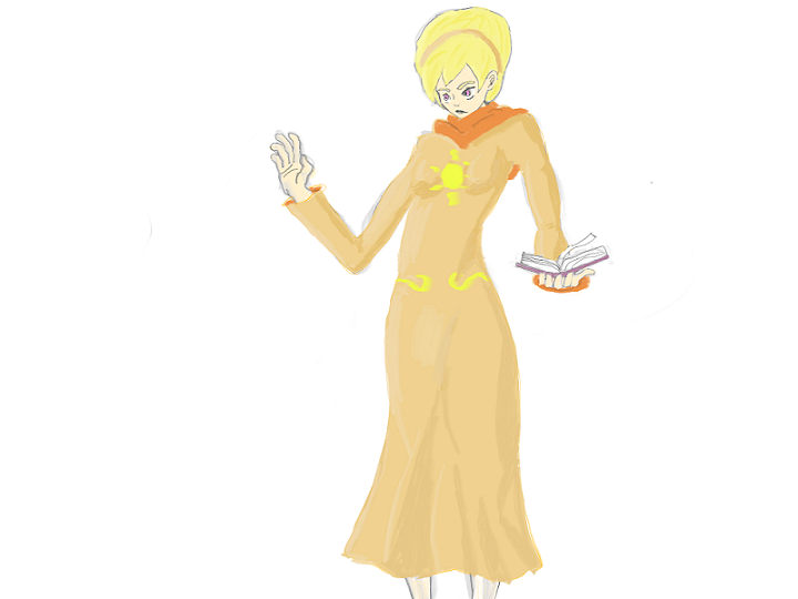
EDIT: Practiced some anatomy since It's been a few months since last I drew anything. I tried my hand at drawing some Homestuck fan art.
About a week ago I did my first painting in a while, and would love critiques on it.

Thanks in advance.
EDIT: Practiced some anatomy since It's been a few months since last I drew anything. I tried my hand at drawing some Homestuck fan art.
Roran Hawkins
Member
Seen
9 yrs ago
I'm still sorry for this, but I draw with my mouse and since that's incredibly hard I just give up on something serious when drawing digitally. I did find this nice website though with lots of feautures, and I drew the following;
I know you can't really give decent critism on those, but I felt like posting what's keeping me busy.
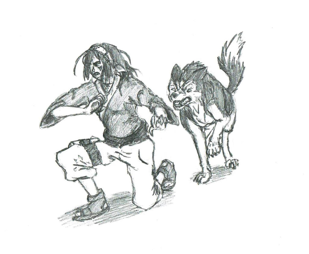
Also drew this one:
I kinda like how the wolf turned out, it's my first time drawing canines, but the girl is messed up. Her face is oompf , her sleeves are made with metal thread, and there's something wrong about her hips.
monstahunta
Member
Seen
10 yrs ago
Roran Hawkins said -snip-
I love the wolf in your shinobi picture.
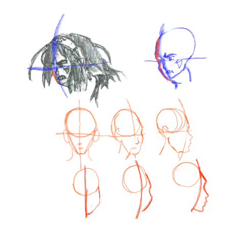
As for the girl's face, I've drew this for you to take into consideration, should you decide that you want to.
Notice that the further the head's turned along the x-axis, the more pronounced the cheeks, and forehead become.
Roran Hawkins
Member
Seen
9 yrs ago
Thanks for the feedback :D
Considering the girl, I messed up and I was simply too lazy to fix it, I didn't want to erase it and start over you see (I'm such a little shit) and concerning the wold, thanks :D I've been reading Off-White and that has been a maaaaajor help for drawing that one.
EDIT:
More drawings:
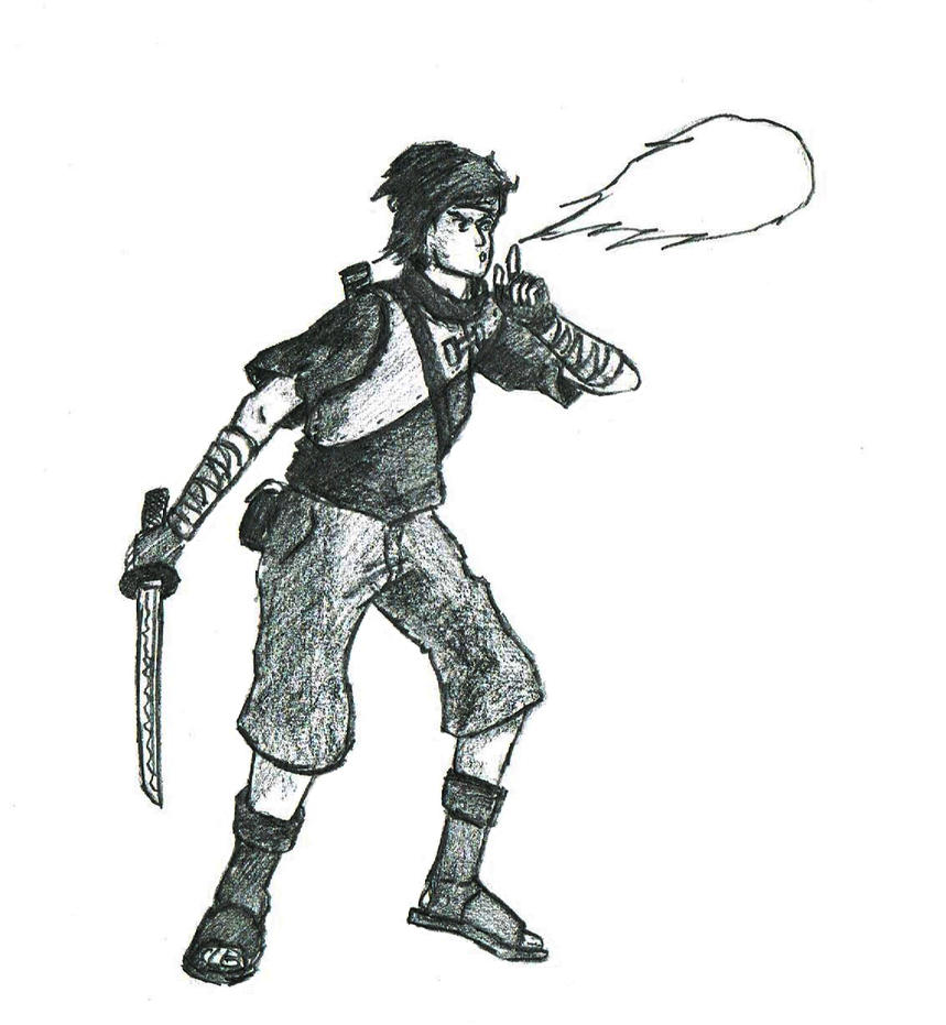
Yes I noticed this shinobi guy has the same problem. This is again the same problem, but then combined with drawing a person who is blowing pure fire etc.
I think i'll join as well.

This is a WIP, I know a bunch of the demons anatomy is still kinda fucked up but i'll fix it later, ie the hands and his relative size. Basically it's a chained angel. Still need to do the chains.

This is a WIP, I know a bunch of the demons anatomy is still kinda fucked up but i'll fix it later, ie the hands and his relative size. Basically it's a chained angel. Still need to do the chains.
monstahunta
Member
Seen
10 yrs ago
Roran Hawkins said -snip-
Another Shinobi - Your perspective seems to be a little wonky in this picture. Most noticeably in his shorts. I may draw a quick reference later to help with perspective when drawing characters.
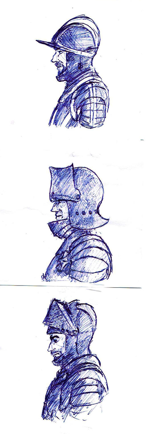
Storm Troopers - Very, "comic-y", style, and I like the detail work on the helmets. Good job
Lords of War - I don't like the shading on the second picture. Particularly on the flap of his helm. Notice how the shading doesn't follow the shape of the flap? The other two look nice though.
Brand said -snip-
Sketch 1 - His lips look a little lopsided. They appear to be drawn down to the left, but if that were the case, then the chin would compensate slightly for it. Otherwise great.
Sketch 2 - Looks amazing!
WIP - Unless there is a lot of grey reflected light in this picture, the shadows on the angel appear dull to me. Just my opinion, but I would try a more saturated color for the shadows.
Random - I really like this piece, but the light grey blocks in the background tend to draw my eyes away from the lady's face.
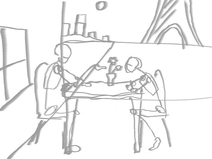
EDIT: So for practice I wanted to draw a couple sitting, and this is what came out of it:
I just guessed on the perspective, so I'm definitely going to have to fix that should I decide to continue working on it. To be completely honest though, I tried to flesh out the idea already, and I just couldn't make it look like I wanted it to. So now even the idea of finishing it is a little daunting to me. I was on a roll while sketching out the basic elements, and now it feels like I crashed right into a brick wall.
OP
stark snarky genius
Member
Seen
4 yrs ago
Notice: Things have been a bit hectic this week. (Home renovations. Ugh.) I'll get to typing up critiques/help this weekend. (Hang in there!) In the meantime, I love seeing other people helping each other. Anyone can feel free to chime in at any time on posted work and offer any help they think they can!
Two more portraits. My goal with these portraits was to create depth using only economy of line, and not using any form of blending. Unfortunately, graphite has the tendency to want to blend, so it was kind of difficult. I feel like the second picture is far more successful in terms of what I was trying to accomplish, because I spent more focus trying to control the lines. I found that I preferred the look of more evenly spaced cross hatch lines, and so the extra time spent on the spacing was worth it. I'm not entirely sure if its exactly where I want it though, as I've heard someone tell me before to avoid cross hatch lines that go everywhere. I feel like my lines sorta look like they are going everywhere, but I was following the form. Anyone with experience cross hatching here would be welcome to chime in their process.
The camera also kinda erased my lightest lights, and lightened my dark tones pretty considerably.
The camera also kinda erased my lightest lights, and lightened my dark tones pretty considerably.
monstahunta
Member
Seen
10 yrs ago
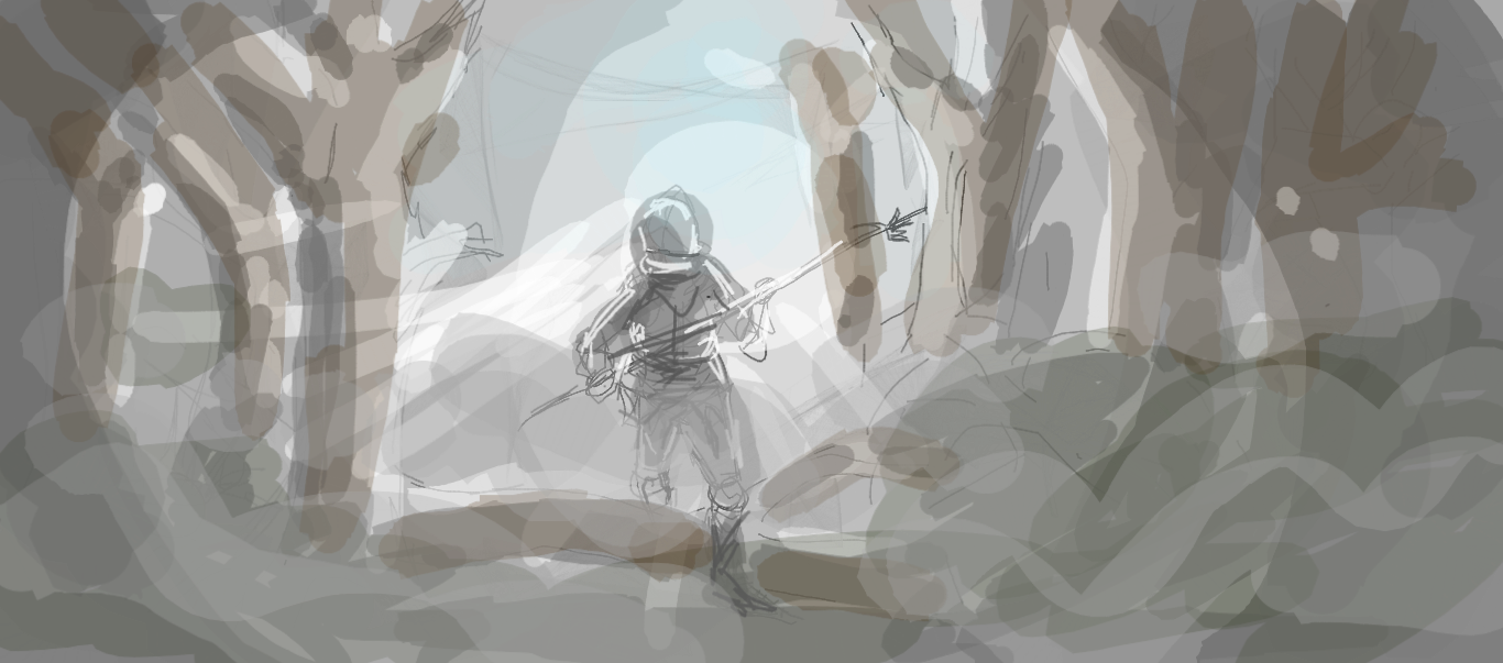
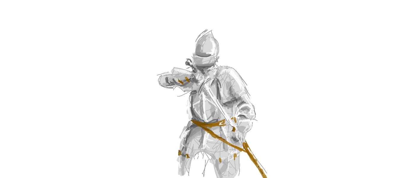
My first, "Multiple Sittings", project that I've done in a while. I'm normally really lazy when it comes to my art, so I'll usually opt for a bunch of practice over taking on an idea that I've come up with.
Mostly I just do a lot of rough sketching, or some slightly less rough sketching, and add a little color. This time I tried to refine my lines much more, and focus on improving my coloring abilities.
I'm pretty happy with the results, so I think I see more detailed practice sessions in my future.
Mostly I just do a lot of rough sketching, or some slightly less rough sketching, and add a little color. This time I tried to refine my lines much more, and focus on improving my coloring abilities.
I'm pretty happy with the results, so I think I see more detailed practice sessions in my future.
monstahunta said
snip
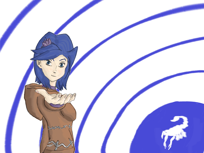
Your foreshortening is good. The biggest problems I see is the structure of the face. For an anime style, the right side looks good. But I feel like the left eye is angled oddly, and needs to be drawn facing the viewer more, and we should see less of the ear too, but just a tad less. I think its mostly the left eye. The second problem, and the biggest in my opnion, is the background. I feel like the background is competing with your subject. I think even just filling in the white with some other (lighter/ less saturated) color would do good, and It also never hurts to make your background fade gradually following the lightning of your subject. So darker in the lower left corner, and lighter in the upper right with the light source. I also feel like more contrast on the subject wouldn't hurt, but honestly since your drawing more of an anime style anyway I'm not sure how necessary that would be. Like I said earlier, your foreshortening is pretty damn good.
monstahunta
Member
Seen
10 yrs ago
Brand said
Your foreshortening is good. The biggest problems I see is the structure of the face. For an anime style, the right side looks good. But I feel like the left eye is angled oddly, and needs to be drawn facing the viewer more, and we should see less of the ear too, but just a tad less. I think its mostly the left eye. The second problem, and the biggest in my opnion, is the background. I feel like the background is competing with your subject. I think even just filling in the white with some other (lighter/ less saturated) color would do good, and It also never hurts to make your background fade gradually following the lightning of your subject. So darker in the lower left corner, and lighter in the upper right with the light source. I also feel like more contrast on the subject wouldn't hurt, but honestly since your drawing more of an anime style anyway I'm not sure how necessary that would be. Like I said earlier, your foreshortening is pretty damn good.
Thanks for the input! =D
I tried to angle the left eye with the face, as it's sort of looking down, and turned, but after reading your thoughts, I can now see that it's a little screwed up. I'll try to fix that.
I sort of like how the ear looks though. Perhaps if I pushed it back a bit further it would look more like I want it to, and not look like I'm showing too much of it? I'll give that a shot too.
Backgrounds... yeah. I'm terrible at doing backgrounds. It's my weakest area as an artist. =\
I can definitely see how more contrast would help the picture, since a great deal of the picture is blue, but that's sort of the theme for the character. =]
EDIT: Or do you mean more contrast in the color scheme as a whole?
monstahunta said
Thanks for the input! =DI tried to angle the left eye with the face, as it's sort of looking down, and turned, but after reading your thoughts, I can now see that it's a little screwed up. I'll try to fix that. I sort of like how the ear looks though. Perhaps if I pushed it back a bit further it would look more like I want it to, and not look like I'm showing too much of it? I'll give that a shot too. Backgrounds... yeah. I'm terrible at doing backgrounds. It's my weakest area as an artist. =\I can definitely see how more contrast would help the picture, since a great deal of the picture is blue, but that's sort of the theme for the character. =]EDIT: Or do you mean more contrast in the color scheme as a whole?
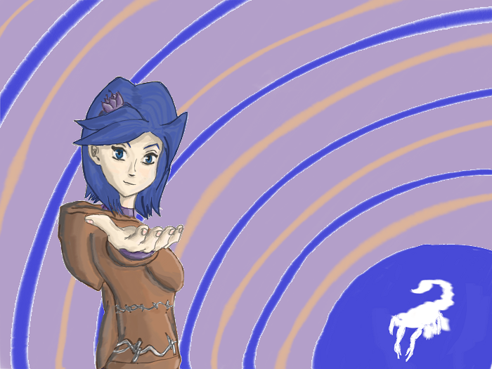
I just meant values. But repeating the skin tones or the tones of the clothes elsewhere in the painting (although far more unsaturated and with values that fit) would help unify all of it.
monstahunta
Member
Seen
10 yrs ago
Added more values, and I really like the feel they gave the picture. I also fixed the eye, but somehow lost the expression I was going for.
Corel Painter X3 was being temperamental, so I lost some of the more refined lines from the original.
© 2007-2025


